 Whats With The Flat Look
Whats With The Flat Look
Whats With The Flat LookWhat's with the "flat look" in GUI's of late? (2014) It looks so 1992. First Apple flattened their phones. Then in the new Internet Explorer, you cannot even tell they are buttons. I like dimension and shadows. It gives realism and breaks up the monotony of a flat page. Why devolve? Am I a fogey? How long will this dumb fad last? Get off my 3D lawn!
Partly, it's a fashion thing. Fashion evolves by changing, and not always for the better. Partly, it's a resource-consumption thing. The shadows and shaded borders of skeumorphic displays requires larger image files and more GPU/CPU horsepower than flat style. On mobile devices, that translates into better battery life and faster response for flat style.
If that were true, why didn't version 1's have flat instead of waiting until version 6 or so? And why has desktop software copied the flat look? Buttons were shaded in Windows 95, almost 20 years ago. And the iPhone added all kinds of fancy dancy animations since. If battery life or response were their concern, they'd skip the dances. I don't think battery life or speed was the primary trigger of the fad.
Fashion and function have acted together. Fashion provides encouragement to adopt a flat style that improves battery life. Improved battery life provides encouragement to adopt the flat style fashion. Alone, each wouldn't have been sufficient to change display style. Together, they are sufficient.
Desktop software has implemented flat style because flat style is the current fashion.
There ways to get computationally cheap shading. Oh well, I'll just learn to live with the wipper-snapper flat look for 5 years until it's replaced by translucent gummy-gel buttons that squirt rainbows and stars when pressed, or whatever the hell is the next fad. Change is JobSecurity.
There are ways to get computationally cheap shading, but they still involve alpha-blending. Flat style is intended to minimise GPU/CPU usage, including relatively simple stuff like alpha-blending.
I disagree that alpha-blending is a necessity to generate a button that looks non-flat. True, without such it may not be very pretty or fancy, but at least give the approximate illusion of a 3D button. I'd still prefer bare-bones 3D over flat. Better yet, give the user an OS config choice: 1) Fancy 3D, 2) Basic 3D, 3) Flat. Ship with the default to "flat", fine, but let us change it.
True, you don't need alpha-blending to create a 3D effect, but you do to create the shading, shadows, and curved edges typical of an "Aero"-style display. Simple 3D was probably rejected as looking too much like Windows 3.0. Style as a configurable choice is fine -- most Linux distros allow it.
I've seen some really "cheap" ways to do "good enough" 3D buttons that doesn't look like old-school Windows. And you don't need rounded edges.
That's true. You can achieve a 3D look with nothing more than a grey rectangle with a white 1px border on the top and left edges and a black 1px border on the bottom and right edges. The effect is trivially enhanced by introducing greyish-white upper left and greyish-black lower right 1px borders just inside the outer border.
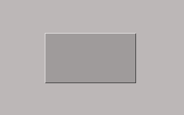
It's computationally cheap -- though it consumes more CPU/GPU cycles than no border at all -- but it looks cheap. Every time I use it, 1994 calls me up and asks me to give back its buttons.
{Why is this necessary again? Most SmartPhone users weren't even alive in 1992, much less remember what UIs looked like then. Flat screen is flat and should look flat.}
Maybe it's like ties and pant-legs: they cycle from wide to thin every 20 years or so, because old is new to newbies.

Prediction: iPhone 8 will have paisley buttons.
I think it also has to do with the shift from desktop to mobile being the dominant platform. A desktop display is a MagicWindow? - you look through it into your DesktopMetaphor, but a phone or tablet is an object among objects. Having a 3d appearance seems weird on these devices... like the edge of the buttons will catch on your pocket.
I don't think Blackberry users worried about the actual 3D buttons catching on their pockets.
Or maybe they did....
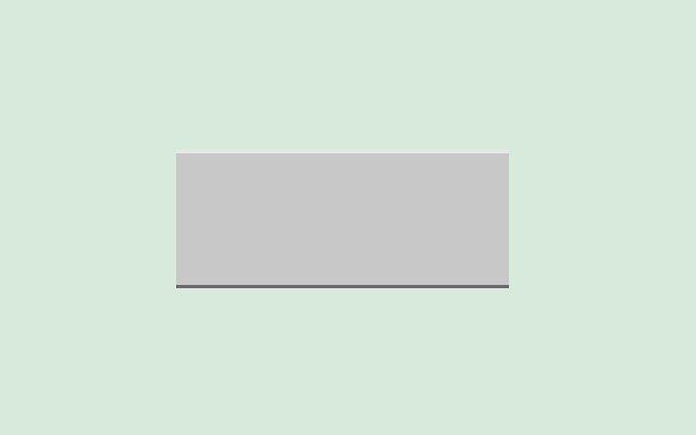
One of the simplest ways to make a rough 3D appearance is to split the button into 3 flat rectangular zones: top, middle, and bottom. The top is tinted a lighter version of the middle color and the bottom is tinted a darker version of the middle color. The top and bottom are somewhere between about 3% and 15% of the total height. No rounded corners, no borders, and no graduations are necessary: just 3 flat rectangles stacked on top of each other. -t
  *----------------*
  |................|
  *----------------*
  |................|
  |...Press Me.....|
  |................|
  *----------------*
  |................|
  *----------------*
(This AsciiArt example does not present realistic proportions. Dots to prevent TabMunging.)
That works for small buttons:

Doesn't work so well for big ones:

Thanks for the examples. Try a smaller top and button width for large buttons. Also, they stand out better when the background is a different color. Although we cannot expect the background to always be a different color, it can help one see what a typical button would look like, as gray backgrounds are far less common these days. Large buttons may also do better with a thin, dark outer border; although that's more computational overhead. Also, the bottom rectangle may be a bit too dark in the large example. -t
Ok...
Not convinced.
Still better than pure flat, in my opinion. And buttons that large are relatively rare for "good" designs. (Thanks for the new example.)
I lightened the bottom bar for a local test, and I think it looks just fine. It goes to show that one must test different combo's of shades and sizes.
Link it. Let's see it.
 (Based on HTML below)
Another one to explore is to skip the top rectangle. However, if the background will vary or be unknown, it's best to keep it to avoid visual border bleed-in. -t
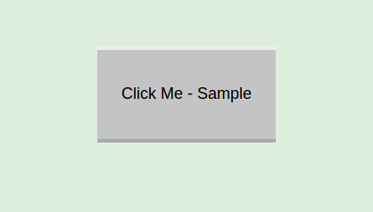
Please leave the HTML code here in case somebody wants to copy it and experiment with sizes, colors, etc. I appreciate the conversion to PNG, but it's okay to have both media types for different reasons.
<body bgcolor="#ddeedd"> <br/><br/><br/> <table width=600 cellpadding=0 cellspacing=0 border=0> <tr> <td width=200 height=4><span style="font-size: 2px;"> </span></td> <td width=200 height=4 bgcolor="#eeeeee"><span style="font-size: 2px;"> </span></td> <td width=200 height=4><span style="font-size: 2px;"> </span></td> </tr> <tr> <td width=200 height=100> </td> <td width=200 height=100 bgcolor="#c4c4c4" align="center" valign="middle"> <font face="arial" size=4>Click Me - Sample</font> </td> <td width=200 height=100> </td> </tr> <tr> <td width=200 height=4><span style="font-size: 2px;"> </span></td> <td width=200 height=4 bgcolor="#aaaaaa"><span style="font-size: 2px;"> </span></td> <td width=200 height=4><span style="font-size: 2px;"> </span></td> </tr> </table> <br/><br/><br/> </body>
Tables? GetOffMyLawn indeed ;) Here's a CSS implementation:

<html>
  <head>
    <style type="text/css">
     body {
       background:#999;
     }
     button {
       background:#ccc;
       color:#000;
       border-width:1px;
       border-style:solid;
       border-top-color:#fff;
       border-left-color:#fff;
       border-right-color:#333;
       border-bottom-color:#333;
       width:300px;
       height:200px;
       font-size:60px;
       text-shadow:1px 1px 1px #fff;
     }
     button:active {
       border-top-color:#333;
       border-left-color:#333;
       border-right-color:#fff;
       border-bottom-color:#fff;
     }
     button:focus {
       outline:0;
     }
    </style>
  </head>
  <body>
    <button>Click Me</button>
  </body>
</html>
The goal was not to create an HtmlStack version of buttons, but to simplify the hardware-side rendering by reducing the polygons, tone gradations, etc. to a bare minimum. If the goal were the simplest HtmlStack version, I'd have you beat:
<input type="button" value="Click me">
As for me, I'm glad we are finally getting rid of the faux 3D UI in applications of the 90's and 0's. I never liked it because the 3D was meaningless. It was pretend 3D, not actual 3D. If we are going to use 3D then let's actually use 3D and not just pretend that our UI is 3D when it is really 2D. Bottom line, I felt when '3D' buttons came in that they were a lie because they were pretending that a 2D interface was 3D, and a disappointment, because I wanted actual 3D. I'm glad that we are reverting to buttons that represent the real interface. -- JonGrover
What do you mean by "actual 3D"?
We see actual 3D mostly in video games, 3D image development tools, and advertisements. 3D benefits greatly from motion. 2D does not need it. I have tried, and never figured out a good way to use 3D in a more conventional application UI. But I still have some hope. Back in the days before the GrahicalWebBrowser? many people (cyberpunk) thought that the Internet was going to be some 3D space you would travel through but it didn't turn out that way.
If you can get rid of the 3D effect and still pretty much have the same user interface then it is faux 3D. If you get rid of the 3D effect and the interface no longer works then you have actual 3D. For example if you get rid of the 3D effect in a first person shooter then you no longer really have a first person shooter. If you get rid of the 3D effect in Maya, then you pretty much can not see what you are building. If you get rid of the 3D effect on the buttons of a calculator app then you still have a calculator app, and it works the same way as before.
Again, your terminology is curious. I've seen "faux 3D" used to refer to the conversion of essentially 2D level definitions to a 3D effect via raycasting in early FPS games like Doom and Doom II. The 3D effect in UIs is usually called the "3D effect."
This is not what I'm talking about.
I appreciate that; I find your nuanced use of terminology obscures the message.
I am open to better terminology.
What you call "actual 3D" and "faux 3D" is typically called a "3D effect" or "3D rendered", depending on context. Its absence is "2D" or "flat".
Footnotes
[1] Setting up virtual people could be a little trickier. However, a cheap short-cut is to define a person as a flat shape with a transparent background layer (blue-screen-like). The person would always face the same way to user. That way the rendering engine doesn't have to actually calculate something as complex as a 3D model of a person. It would be a little creepy at first, but one would get used to it. Note that all the people wouldn't necessary face the user; for you could have side-shots and back-of-heads. This is not as good as true 3D modeling of a person, of course, but allows regular folks and newbies a quick-and-dirty way to place people and animals into their virtual world. (Full 3D may still be possible such that the cheap approach is not mutually exclusive to the full approach.) If the device is not capable of rendering complex 3D, then the above approach can be used as a stand-in, if defined. It's roughly comparable to the "lowsrc" IMG attribute that used to be supported by browsers. -t
It's more closely comparable to using sprites to represent players, NPCs, and props in FPSs, as done back in the days of DOOM.
EditText of this page
(last edited November 3, 2014)
or FindPage with title or text search