 Visualize The Wiki
Visualize The Wiki
Visualize The WikiIf you are looking for working implementations of visualizations of wikis, scroll down.
The notion struck me recently that the vast DirectedGraph formed by all the WikiWikiWeb pages and their interconnections might be quite interesting. You might use GraphViz, or just collect statistics on path lengths and such. In particular,
This is a compelling idea, one that has been explored in the hypertext world almost since its inception. While it has great appeal, a practical realization has so far proven to be unrewarding. The difficulty is that our minds, when we construct these visualizations, are much better at abstracting "noise" than any of the tools available to us at the moment. Thus, naive attempts to draw unfiltered graphs of the nodes and edges of a hypertext quickly degenerate into meaningless hairy blobs. The interesting part, then, is to discover algorithms for discovering which nodes and links are "interesting" - and to find ways to present them on finite screens that convey meaning to a user.
to make this work well, wiki needs to count link clicks: x jumps from this page to that page
I think the idea of building tools to help us VisualizeTheWiki is enormously interesting. I also think it is a perfect context for ExtremeProgramming - get something working first, so the design(s) can reflect the actual experience of a user community, instead of doing a lot head-scratching about what it "should" look like. -- TomStambaugh
Done. See VisualTour, TouchGraphWikiBrowser.
I wonder if it forms a Small World. This is a kind of graph recently studied by people into Complexity. They are somewhere between random graphs and a highly ordered ones. The shortest paths between nodes tends to be quite small - hence the name. A Small World Graph has many small closely connected clumps with occasional very long leaps between the clumps. Key phrases: Erdos Number, 6 Degrees of Kevin Bacon.
All from a failing memory, please correct. -- DickBotting
The Internet Industry forms a Small World [high clustering and short average path length] see the link below and then click on the 'small world network measures' link to see the Small World metrics for this industry. The clustering for this network [to be a Small World] is on the low side, but we are probably missing some data points. -- ValdisKrebs
One quite effective effort to Visualize the Thesaurus lives at http://www.plumbdesign.com/thesaurus/. I recommend it highly to anybody who's embarking on an effort to VisualizeTheWiki. Maybe NotEverythingAtOnce? is a good idea. -- BillTozier
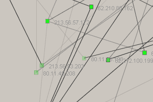
You might enjoy looking at "NeoTrace?" (http://www.neotrace.com), if you aren't already familiar with it. It uses some similar graph-traversal stuff, albeit in a different context - performance analysis.
another attempt to visualize the web (in this case with log file)
http://www.erational.org/software/traceyou/
FlExplorer traces maps from any website very quickly (with depth and wide parameters) OK, it is a map, but VisualTour is considerably better. In these FlExplorer-maps all links seems equally important and therefore there are so many links that the map is a mess.
Thought: FishEye? interface to Wiki. Each node is the title of the Wiki page. Selecting node opens the the HTML viewer. Nodes and connections can be bigger, different colours, whatever based on number of RecentEdits, page size, etc. Whaddya think?
Someone who's really game could add reference-counting, and filter on it. For example, exclude from the graph all nodes that have fewer than 4 inbound links. -- RaySchnitzler
Just discovered a small trove of GraphViz interfaces for mapping RDF metadata (c/o Dan Brickley, w3.org) at http://www.rdfviz.org/ (BrokenLink? 2005-05-15) - including some experiments using Jan Grant's Prolog-in-JavaScript interpreter as an RDF query engine for navigating / filtering semantic relations, very cool indeed ...
See also ZigZag.
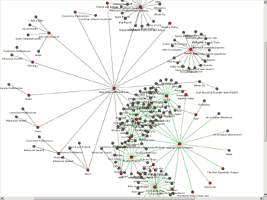
How about this interactive Java applet to visualize an emergent web of Wiki pages?
See: http://www.orgnet.com/DEMO/bizmaps.html for an introduction and interactive sample network.
Here is a screen-shot of the 'maplet'...
As these maps are self-organizing [depends on the pattern of connections], they should reveal emergent clusters such as Small-Worlds and Communities Of Interest
The bizmap referenced above is substantially more interesting and relevant than the static gif indicates. Indeed, it is the most promising platform I've seen for a class of projects - DynamicVisualizationOfEvolvingSystems? - that has fascinated me (increasingly!) for decades. I think the time (and the tools) have finally come, and it occurs to me that a wonderful data set to work on could come from this very wiki [WardCunningham, is there a historical record?].
Here's what I'd like to do - visualize the growth and life, as well as the structure of the wiki. Picture this (check out the dynamic applet at http://www.orgnet.com/DEMO/biznet.html to get the picture):
''In the beginning, Ward created the first wiki pages. A few points in space interconnected, vibrating with potential.
New pages "bud" off other pages. The network re-equilibrates, nodes drift and align, form self-organized visual patterns that reflect their conceptual interconnections. (This should work for the same reasons google works.)
Over time...
This quotation is from http://www.mezzoblue.com/archives/2004/08/11/live_from_si/index.php and might prove relevant to the idea of websites or pages evolving:
11am - I sat in on a few web graphics sessions revolving around navigation. The one that jumped out at me was a project called "Okinawa Wonder" http://alive.wonder-okinawa.jp/ which required intelligent interaction with over 10,000 pages. Though it wasn't clear to me what the data was for, the problems were universal, and the metaphor they used particularly clever.
All data is mapped as a galaxy, each point a "star". Over time the frequently accessed data points spiral out toward the edges, becoming more prominent, and the less-accessed pages float to the center and eventually disappear. There must have been some magic happening I missed because the "stars" themselves were images, and even though it was a minimal interface, 10,000 images stored in memory and rotating around a central axis in real time feels like a long shot.
The metaphor was expanded with further user-configured mapping techniques, notably "constellation" and "planet" modes which weren't explained, but almost don't need to be.
The demo was an interesting way of seeing how other people see data. It's this sort of application that the up-and-coming web application war needs to address; at the moment the only feasible technology to deploy the system on is Flash, or a custom plug-in like they've used in this case.
Another interactive applet can be found at http://touchgraph.sourceforge.net/. This applet includes a mechanism for visualizing web sites. It's Java, with an Apache-style license. -- JackPark
Thinkmap (http://www.thinkmap.com/) is a commercial applications for graph visualization. InFlow? (http://www.orgnet.com/) is another commercial app for social network analysis and similar things. They have a demo applet at http://www.orgnet.com/DEMO/bizmaps.html Inxight has VizServer? (http://www.inxight.com/products/vizserver/) that can do some similar things (there are online demos). -- Paranoid
This functionality seems a natural for an SVG implementation; build an XML document that is transformed into graph edges and nodes for display and modification JavaScript on the client.
Something like the Fisheye view proposed above exists at http://www.thebrain.com/ as a Java application. A bit gaudy, but interesting. I believe that something along similar lines was an original goal of Trellix before it became a web site construction tool.
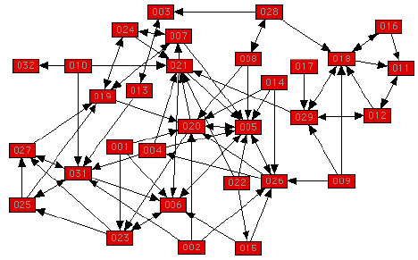
Well, this is interesting. First I run into WikkiTikkiTavi, then I start hacking around it and I find the GraphViz package. But somehow I missed this bit, and thought that no-one had thought of graphing a wiki, so I implemented it myself as a Tavi macro.
So here goes (use the edit page to copy the source not parsed by the wiki engine). Put this into parse/macros.php:
 // Prepare a list of pages and those pages they link to in the format for dot(1)
 function view_macro_linkdot()
 {
 global $pagestore, $LkTbl, $PgTbl, $graphdir;

 $lastpage = '';
 // start of .dot config file
 $text = "strict digraph G {\n node [shape=box,fontsize=8,fontname=helvetica];\n";

 $q1 = $pagestore->dbh->query("SELECT DISTINCT page, link FROM $LkTbl, $PgTbl WHERE link=title");

 while(($result = $pagestore->dbh->result($q1)))
 {
  $text = $text . ereg_replace("[, ]", "_", $result[0]) . " -> " . ereg_replace("[, ]", "_", $result[1]) . " [URL=\"".viewURL($result[1])."\"];\n";
 }

 $text = $text . "}\n";

 // write the .dot config file
 $tmpfile=fopen("$graphdir/tmp.dot", "w");
 fwrite($tmpfile, $text);
 fclose($tmpfile);

 // invoke dot, once for the image map description, then for the image itself
 system("dot -Timap $graphdir/tmp.dot -o $graphdir/graph.map");
 system("dot -Tgif $graphdir/tmp.dot -o $graphdir/graph.gif");

 // write the html file with the imagemap and the image
 $tmpfile=fopen("$graphdir/graph.html", "w");
 fwrite($tmpfile, "<html><body><a href=\"graph.map\"><img src=\"graph.gif\" border=0 ISMAP></a></body></html>");
 fclose($tmpfile);

 // return HTML code to be included in the place where the macro was invoked.
 return ("<a href=\"graph/graph.html\"><img src=\"graph/graph.gif\" width=\"170\" height=\"170\" border=\"0\"><br>Graph of links</a>");
 }
You will also need to define $graphdir in your tavi config to point to a physical directory on the server which is accessible on the web as (wiki root)/graph, with write permission for the web server user. Inside it, four files will be created - the .dot description, .gif image, a .map file and an html wrapper file for the imagemap.
In my case, it is $graphdir="/var/www/html/tavi/graph". You will also need to enable the macro in libs/defaults.php (just add:
'DotGraph?' => 'view_macro_linkdot',into the $ViewMacroEngine array).
Now, if you include the macro [[DotGraph]] in a page, the page will regenerate a link graph into the configured directory, and display a thumbnail and a link to it. The graph itself will be on an HTML page with an imagemap with links to all the pages.
As an afterthought, this might require a recent version of Tavi...
Yes, I know it's not the prettiest bit of code, but it works. I'd like to hear from you if you like this or improve on it.
-- UnreaL. (unreal at hinet dot hr)
Moved from UseGraphVizToGenerateCustomVisualTours
You can vary the "d3" and "w2" parameters to change the width and depth of the search that generates the graph. These graphs aren't clickable like the real VisualTours.
At IBM Research they are studying ways to visualize the revision histories of Wiki documents. It's not the same as visualizing an entire wiki, but they claim to find interesting patterns in Wikipedia editing. Here's their project page: http://www.research.ibm.com/history (their method is something called HistoryFlow?).
Hi, I'm KyleCranmer? and I have been working on similar things and embedding Latex in my wiki. Check it out http://www.theoryandpractice.org/kyle/Wiki/GraphStructureOfConcepts http://www.theoryandpractice.org/kyle/Wiki/BrainStorm
This is more related to querying than visualization per-se, but I thought it is an interesting way to search Wikipedia content: http://omnipelagos.com/
Have a look at PpQwiki. It allows you to reverse Engineer a MindMap from FreeMind (and preserve the formatting) - fill the nodes with extra text and new links and then redraw the new map - or show the structure of an existing Wiki as a MindMap - I'm currently working on it and need some help for a powerful version management system.
Already before visiting this page, I have made a modest proposal regarding this topic. The idea would be to define relationship between different concepts (page titles) defined in different wiki pages. A tool (one of listed above, or there extension) could trace the pages and generate, in form of bitmap, SVG or similar format UML like diagrams. The diagrams, based on the "language" of the model would tell then much more information about certain concepts and relation between them, than simple graphs. UML started with simple graphs as well. : We could use sthg. from the UML experience, why not, isn't it? I have started to write some pages about my idea, they are not really smart but maybe as a start : WikiMap, SpecializesThe, etc. -- MihalyElekes?
Hi, I'm AmberCase and I have been working with AaronParecki? to build http://cyborganthropology.com, a MediaWiki install.
AaronParecki? built two pieces of visualization of the edits made to the wiki over months and by day of the week. This is a different approach from some of the ideas of visualizing wikis based on links. This one is based on edits per time of day, day of week, or month.
This first graph shows average edits per hour of day:
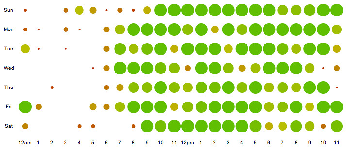
This second graph shows edits per month based on day of the week.
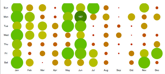
The visualizations are live at http://cyborganthropology.com/Special:ChangeGraphs Mouse over the bubbles for edit information.
Two questions - are these data for this wiki or another one? If for this wiki, what is the base timezone, as different people active on this wiki live in different time zones? -- JohnFletcher
Without a doubt, the best way to visualize the wiki will be with a ThreeDimensionalVisualizationModel. See http://www.caida.org/tools/visualization/walrus/gallery1
The issue of ordering can be addressed with PerItemVoting and UserRanking. Ultimately with hyperlinking, you're creating an n-dimensional space and projecting into a 3-dimensional visual space. (With conventional WWW, you have about a 2.3-dimensional textual space, but why not make use of the visual cortex to form relationships?)
See PangaiaProject, which hopes to create the PeerToPeer Internet and a new economic system: the CreativeEconomy.
EditText of this page
(last edited November 9, 2014)
or FindPage with title or text search