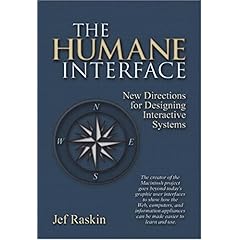
 The Humane Interface
 The Humane Interface
The Humane Interface: New Directions for Designing Interactive Systems by JefRaskin

Publisher: Addison-Wesley Professional; 1st edition (March 29, 2000)
 ISBN  978-0201379372 , ISBN  0201379376
 http://rchi.raskincenter.org/
(See also Jef's official site at http://rchi.raskincenter.org/ where he was putting his ideas into effect in TheHumaneEnvironment, later renamed ArchyProgram?.) Note: As of 10/11/2012, raskincenter.org is no longer in existance. I turned to the Wayback machine, but there are no backup's due to a robots.txt file. Jef is gone, and now his final work has disappeared. :(
There are some theoretical foundations in the book: GOMS analysis and some cognitive psychology stuff on attention loci, etc.
Some of the points of the book:
People develop habits. Habits are good because then you can focus on other tasks. Thus, asking for confirmation is bad because users will develop a habit of confirming the command, or the interface will be obnoxious to use. Thus, commands must be undoable. Furthermore, adaptive user interfaces are bad, if the adaptation interferes with habits formed.
Modes are bad because they cause errors, even when there is an indicator for the mode. That's because people will focus on the task, not on indicators. This applies also for hardware (powerswitches are bad) and applications (restarting an application should put you back where you left it, not in another mode). QuasiModes are good -- pressing a key to activate a mode (such as Shift, Control, Alt, or Meta) is good, because the touch required provides feedback on the mode. Therefore LeapMode is good.
Monotony is good. If there is only one way of doing things, then people develop habits and feel secure and in control. If there are too many choices, it is difficult to teach, and difficult to use because you have to decide how you will do something.
Customization is bad because people tinker too much with the system. There is no proof that after customization, people are more productive. Furthermore, the software is harder to test, and harder to debug. And there is no reason to believe that users will be better usability engineers than the authors of the software. Plus a lot of choice makes the system non-monotonous (see above).
Icons are bad because as soon as you have more than a very small number of them, they need explaining again. Therefore, stick to texts.
The Zooming Interface is something to replace applications, desktop, browsers, etc. All of the content is displayed on an infinite virtual plane. As you zoom closer, documents can be edited. See ZoomableUserInterface.
Filesystems are bad. Instead, just provide an interface where the user can type text. If not the zooming interface, then perhaps the old CanonCat interface -- one huge text with document separation characters. If it is easy to select text and print it -- ie. it is easy to mark the text between two document markers -- then files are not useful. Consider the hassle of learning the importance of files, directories, filenames, etc. when all the user wants to do is type text and print it.
For which an old fashioned pencil(with built-in eraser) and paper pad will suffice
And which if you want to store it for later recovery, you can merely scan it and write down the place and name of where you put it in your day-timer (or even put it there).
Related: DontModeMeIn, NewOsFeatures, KillerUserInterface
 EditText of this page
(last edited October 11, 2012)
or FindPage with title or text search